Chapter 6 from the R.M. Dolin book, “Truth and Trust in Crisis,” 2021
“Gestalt – The whole is greater than the sum of its parts.”
May 5, 2020: Three weeks is forever in a crisis, especially considering all that’s been lost, including, trust. The cumulative COVID deaths according to CDC has climbed to 68,934, and while this is tragic, it’s significantly less than the 500,000 Americans we were told would die by the end of April.
Three dramatic weeks ago, our trust in crisis managers Brix/Fauci was implicit; a trust so unwavering we formulate a hypothesis to disprove COVID is manmade. We’re so confident all fingers for this catastrophe point at China, we develop a null hypothesis asserting if the virus behaves different than a naturally occurring virus it’s manmade. To prove our null hypothesis, we develop an exponential model, because things in nature follow exponential patterns and discover the COVID virus behaves like a natural virus, which doesn’t negate the possibility it’s human engineered.
Our analysis takes us beyond proving COVID’s origins to investigate why academic models are so hyperbolically wrong, and why there’s no interest in correcting them. Assuming COVID behaves the same everywhere, we use the Italian COVID crisis to build a statistical inference to predict that by April 14th, the U.S. will likely have 30,500 cumulative COVID deaths. This seems wildly implausible as experts assure us there will be 250,000 COVID death by then. When apex day arrives, however, the death count is 23,650, slightly below our prediction but inexcusably ten times below expert assessments.
The aftermath of Armagedón is as shocking as it is unbelievable. By announcing COVID’s in remission, the CDC finds themselves at odds with government experts. Not to be upstaged, Deborah Brix announces CDC data cannot be trusted and counters by asserting COVID deaths are being under-counted even though her partner Anthony Fauci contends they’re being over-counted. To find out which side of trust CDC data lies, we’ll use our exponential model to track COVID’s remission and use our monthly projections to compare against the big three COVID models from the UW, University of Pennsylvania’s Wharton School of Business (Penn), and the Federal Emergency Management Agency (FEMA). We’ll even be so bold as to predict the day when COVID’s no longer an epidemic and look for validating evidence in unlikely places.
After their embarrassing performance in April, you’d think responsible bureaucrats and academics would humbly ask for forgiveness and fade from the limelight, however, the intoxication of fame, coupled with American’s insatiable need for news, even when wrong, keeps COVID experts at the forefront of our crisis. Recall how recklessly unrestrained academia’s behaved, first the UK model projects 2.2 million Americans will die by October, then UW ups the ante by projecting 250,000 deaths in 14 days, which equates to a death rate two times higher than the UK model.
The same UW crew that was 1,057% wrong in April, boldly roars back in May with a new projection, only this time, after having repeatedly embarrassed themselves, they’re presenting an estimate so devoid of meaning it’s clear they no longer believe in their ability to perform credible data analysis. UW projects that by August 4th, between 95,000 and 243,000 Americans will have died from COVID[1] . Notice they no longer provide a single number, which is an indication they’re learning to hedge their bets, only the range is so wide, the model is not useful for anything other than parody but unfortunately, the government decides to use it for policy. Brix/Fauci[2] assert between 75,000 and 100,000 Americans will have died from COVID by August 4th. Given how poorly previous assertions and projections performed, one expects journalists to challenge these dire estimates or at least question why they’re so different, instead, we get compliant silence and a concerted media effort to censor any challenge.
Adding upper and lower bounds is deftly strategic because the media never reports the lower number as it lacks hysterical impact; like they’re fond of saying, “if it doesn’t bleed, it doesn’t lead.” State and federal policy makers also focus on the upper bounds to justify continued lockdowns and mandates. If August COVID numbers come in at the high range, our experts can tout their prowess at accurately modeling outcomes. If August numbers come in at the low range, they’ll take a victory lap for the success of their mandate measures, and if the numbers fall in between, it’s an optimal combination of both.
Our predictions will be based on the gestalt of multiple models where each model provides elements of information that, when subject to scientific rigor, can be used to amass credible estimates of what’s likely to happen. Alone, anyone one models is insufficient, providing only a piece of the COVID prediction puzzle, but their gestalt allows credible predictions to be formulated.
Each model employes different logic and analysis methods along with different assumptions and thus, yields different results. This does not make one model necessarily better than another as each provides insight. Knowing when and how a model is optimally appropriate comes down to experience and an understanding of the model’s limitations, which is where our scientific approach becomes paramount. This is a salient distinction from the Brix/Fauci and UW models. Brix/Fauci are medical doctors, not scientists, the UW model was developed in a university medical department, not a STEM department. The Penn model comes from a business school, and while likely skilled at statistics and accounting they are not trained in the scientific methods of data analysis. The FEMA model is developed by bureaucrats and likely lacks scientific rigor.
As with any scientific endeavor, we begin by stating our knowns,
- The first COVID death[3] in America occurs on February 29, 2020.
- As of May 5th, there have been 1,180,634 confirmed COVID cases with 68,934 reported deaths.
- The percentage of the population infected is 0.369%, and the percentage of those infected who die is 5.84%
- The percentage of Americans tested thus far for COVID is 1.62%
- The preCOVID number of Americans expected to die from something in 2020 is 2,863,859, or 7,825/day.[4]
- Herd immunity is achieved when 60% of the population becomes infected[5] and the virus dies from lack of new hosts.
- The official 2020 U.S. population is 328,200,000; undocumented populations excluded.
These knowns are used to generate our different COVID models, each providing elements of information that when combined, render a prediction based on the gestalt. I’d ask you to trust these models, but we agreed to a zero-trust approach, so you’re encouraged to run the numbers and make your own decision as to how best to apply each element of information into your gestalt.
The current incarnation of expert models projects out to August, which makes me wonder if they believe that’s when herd immunity is reached. They’re not saying, but let’s test this hypothesis and see if we can generate an estimate of our own. Keep in mind, achieving herd immunity is one way this crisis ends.
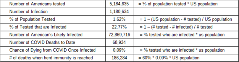
Model 1: Assume CDC Data Is Correct
While we don’t know how many people have been infected, because we haven’t tested everyone, we know how many have died. Given that 1.62% of the population’s been tested and 1,180,634 COVID cases are confirmed, if the entire population were tested there’d likely be 72,869,716 confirmed cases or 22.77% of the population. If ~73 million Americans are currently infected, it means the chance of dying once infected is ~0.09% and the projected number of deaths when herd immunity is reached becomes 186,284, which is above the upper UW and Brix/Fauci estimates. This model’s supporting math is provided in Table 6.1. and while it provides an estimate for the number of COVID deaths likely to occur by the time herd immunity is achieved, it does not provide a timeline.
Table 6.1. Assuming the CDC Data is Correct.
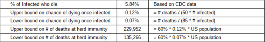
Model 2: Assume Results of Stanford Study
A weakness in our first model’s logic is that the 5.2 million Americans currently tested for COVID were not randomly selected, but rather suspected they had COVID and then got tested. According to a Stanford University study, if a random sample of the population were to be tested, we’d find 50 to 85 times more infections than the CDC confirms.[6] If that becomes the basis for our death count estimate at herd immunity, then between 135,000 and 230,000 deaths would occur, which is close to the UW projections and bounds the Brix/Fauci assertions as shown in Table 6.2.
Limitations of this model include that the upper and lower bounds are too wide to be meaningful, and it assumes a uniformly distributed population, i.e., that an average person in Manhattan experiences the same COVID journey as an average New Mexican.
Table 6.2. Assuming the Results of the Stanford Study.
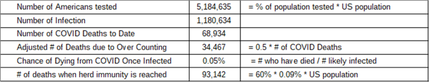
Model 3: Assume the CDC Overcounts COVID Deaths
The CDC has a history of sensationalizing data[7]. For example, in 2014, they predict 500,000 people will die of Ebola in West Africa when only 28,600 die. During COVID, the government incentives medical doctors and hospitals to attribute nonCOVID deaths to COVID,[8] which skews the data toward unrealistically high death rates. Several states, including New York[9] and Pennsylvania[10], admit to inflating their COVID deaths, some by over 50%. If we project the number of deaths when herd immunity is reached based on the number of people likely to be infected, then half the number to account for confirmed rates of over-counting, we arrive at a projection of 93,142 deaths when herd immunity is reached. This is below the UW and Brix/Fauci estimates as shown in Table 6.3.
A limitation of this model is that while some states intentionally overcount COVID deaths, not all states do so we don’t really know what the data-falsification factor should be. Also, because the medical profession can’t be counted on to act honestly, we know we cannot trust whatever they report and therefore know the data-falsification factor is greater than one.
Table 6.3. Assuming the CDC Over Counts COVID Deaths.
Model 4: Assume Actuarial Assessments
When one source of data is corrupted, other valid sources likely exist if we’re creative. For example, highly accurate pre-COVID estimates exist for the number of Americans likely to die this year from all causes; including heart disease, cancer, diabetes, etc., and the advent of COVID does not treat heart disease or cure cancer. Therefore, these pre-COVID predictions remain constant and COVID deaths add to pre-COVID estimates. This obvious observation is going to be of paramount importance going forward as CDC data becomes increasingly untrustworthy.
Actuarial data provides a definitive alternative for assessing the number of COVID deaths when CDC data is suspect. We can use actuarial tables to determine the number of deaths expected to occur in the U.S. pre-COVID then subtract that from the number of deaths that have occurred from all calamities, including COVID; the delta represents COVID caused deaths. What gets lost in this approach is information about the people who die from COVID who were going to die from something else and the people who die from something else that medical doctors attribute to COVID. What remains though is ground truth; the number of people who have died.
Prior to COVID, 2,863,859 Americans are expected to die from something in 2020, which means that by May 5th, 985,919 Americans are expected to die from nonCOVID caused calamities assuming a linear dispersion. However, 984,462 Americans have died thus far, which means 1,457 fewer Americans have died so far this year than were expected pre-COVID. The limitation of this assessment is that there’s no distinction between people who die from COVID and those who die with COVID. Nonetheless, this is a valid measure of the impact COVID has on the country’s overall death count and is an astonishing outcome given the panic and hysteria being promoted.
Table 6.4. Actuarial Assessment.
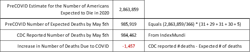
This result indicates fewer Americans have died thus far in 2020 than were expected to die pre-COVID. A controversial conclusion that can be drawn from this result is that all the people who the CDC reports as having died from COVID thus far in 2020, were likely going to die this year from something else because no one who was going to die this year from something else is going to live because of COVID. We’ll track this model often to see if this trend continues for the remainder of the year.
This model assumes that actuarial deaths are evenly distributed throughout the year. While that’s not likely true, it’s probably not far off. Even with this result’s caveats, it can be used to conclude that the overall impact of COVID relative to a non-COVID year is not as significant as we’re being told. This defies logic because after all the hysteria, it appears COVID is having minimal impact on American deaths thus far.
Model 5: Exponential Growth and Decay
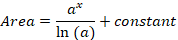
We can extend our simple exponential function, f(x)=ax, to both estimate the number of COVID deaths at herd immunity and when it’s reached. For this we use the knowledge gained during COVID’s assent up to the government apex to project a likely descent down to herd immunity. After that we can integrate the curves to find the projected number of deaths. This involves a lot of calculus, but don’t worry, there won’t be a test at the end.
To determine COVID’s impact we can compare the overall number of deaths in the U.S. this year from all causes against pre-COVID expectations as done in the actuarial model. Through May 5th, the overall number of U.S. deaths are 1,457 below what would have been expected had COIVD not happened. Projecting the number of deaths likely to accrue by August 4th, depends on three variables
- When the COVID expansion apex was reached.
- The pace at which death rates decline while COVID’s in remission.
- Where the tapering tail of the exponential curve is truncated.
Figure 6.1 captures the rise and fall of COVID deaths per our exponential model. The blue segment represents COVID’s exponential growth up to its apex, which we previously validated. The red line represents COVID deaths from the apex to present, and the yellow line represents our model’s projection out to August 4th.
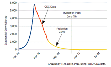
Figure 6.1. Exponential Model Predicting the End of COVID Pandemic.
Mathematically, the area under the curves represents the cumulative number of deaths, which can be represented as the integral of the exponent. In general, if the function is represented as f(x)=ax, then the integral with respect to x, is
From this equation, the area under the blue portion of the curve is 20,608, which correlates to the CDC reported number of COVID deaths on April 14th. The combined area under the blue and red curves is 73,431, which correlates to the CDC reported number of COVID deaths through May 5th.
The yellow curve approximates the exponential rate of decline in COVID deaths from May 5th to August 4th. Our model approximates that by August 4th the cumulative COVID death count will be 85,656. Mathematically, the yellow curve extends to infinity, so must be truncated at some point. The CDC combines pneumonia, influenza, and COVID (PIC), deaths into a single number. Because a PIC number is used, zero deaths are not possible since both pneumonia and influenza are endemic. The minimum value for truncation would be 85 deaths/per day as it’s the endemic rate for pneumonia and influenza we accept as normal. Using this metric, our exponential model projects that the COVID epidemic ends on June 7th. If you think that’s an absurd assertion based on government and media hyperbole, your skepticism is appropriate.
This is a pivotal moment in our assessment because we’re asserting that a month from now, COVID ceases to be an epidemic. Given government and media hyperbole, having the audacity to suggest the crisis is about to end borders on preposterous. I share your sentiment, when our analysis first suggests this outcome, I run, then re-run the numbers looking for errors until eventually convincing myself the math is solid, the logic consistent, and our data validated by observational evidence. We’re staking our flag on June 7th in stark contrast to marketing narratives. This then leads us to the matter of validation, specifically, how we decide when COVID has abated. As scientists we must comply with standards and certain thresholds must be met, such as independent confirmation of our outrageously preposterous prediction.
UW projects 243,000 deaths by August 4th. The White House COVID Task Force projects 100,000 deaths by this date. Our model, based on a first principles analysis, projects COVID ceases to be an epidemic on June 7th, and by August 4th, 85,656 PIC deaths will have occurred. When pneumonia and influenza deaths our subtracted from our projection, the number of COVID deaths is even further reduced.
One likely reason the academic projection and government assertion differ is because these two nonscientific estimates are driven by competing narratives. The academic projection is utilized primarily to justify media hysteria and government mandates, while the White House projection is driven by an incumbent president’s need to put the pandemic behind us in time for November elections. Our model, which is based on observable evidence is devoid of narrative.
Based on observable evidence and the gestalt of our five models, the rate of COVID’s decay appears to be following its rate of expansion. In other words, the rate at which the country went from zero deaths on February 28, to the April 14th apex is nearly the same as the rate in which the virus is currently decaying. If COVID’s remission precisely mirrors its expansion, the truncation date would be June 2nd, which makes our June 7th projection pretty darn close. It also means that states should be fully re-opened by early June, only don’t hold your breath, COVID’s quickly becoming a useful political pandemic and November’s not that far away.
Note: This chapter is based on a series of 2020 essays submitted to major media outlets, including the NY Times, Washington Post, and Chicago Tribune. The essays can be found at: https://rmdolin.com/commentary/
Read rest of “Truth and Trust in Crisis.”
[1] U.S. Death Toll Projections Double As Researchers Measure Impact Of Eased COVID-19 Lockdowns (forbes.com)
[2] Trump raises coronavirus fatality projection to as high as 100,000 – CBS News
[3] First death from coronavirus in the United States confirmed in Washington state – CNN
[4] United States Deaths Clock – IndexMundi
[5] Rethinking Herd Immunity and the Covid-19 Response End Game | Johns Hopkins Bloomberg School of Public Health (jhu.edu)
[6] Stanford study: More than 48K Santa Clara County residents have likely been infected by coronavirus – Palo Alto Online. [Link]
[7] Horowitz: Dr. Birx: ‘We’ve taken a very liberal approach to mortality’ – TheBlaze
[8] Minnesota doctor blasts ‘ridiculous’ CDC coronavirus death count guidelines | Fox News
[9] New York City coronavirus death toll jumps past 10,000 in revised count – Gadgets news – NewsLocker
[10] Pennsylvania Takes Hundreds of ‘Probable’ COVID Deaths Off Books After Coroners Come Forward (westernjournal.com)
