
Chapter 10 in the R.M. Dolin book, “Truth and Trust in Crisis,” 2021
We have asserted with increasing confidence that CDC data is being manipulated and falsified, causing us to seek other sources of truth from agents we trust. One such source is actuarial data; actuaries are accountants who use mathematics, statistics, and probabilities to evaluate risk and make predictions of future outcomes. Insurance and financial industries rely on actuarial data to set premiums and interest rates. Actuaries use their data to anticipate future events providing policy and decision makers with informed clairvoyance. Because company and corporate profits depend on actuarial data, it must be highly accurate and implicitly trustworthy.
You are the provider of actuarial data. For example, the movies you watch, what you buy online or in stores, where you vacation, what’s revealed during doctor visits, etc., all become data that actuaries collect. Your insurance premiums are set by actuaries that predict with eerie accuracy how long you’ll live, whether you’ll die in a car crash before cancer, and whether your kids finish that expensive private college they had to attend.
Actuaries track large populations to inform politicians on elections and medical professionals on the type of medicines, skills, and facilities needed in a given region. For example, the U.S. Population in 2020 is approximately 334.3 million, with the average lifespan of 79 years (76 years for men and 81 years for women).[1] According to IndexMundi[2], approximately 2,863,859 Americans will die in 2020 from something. Of the top ten causes, two are non-health related: accidents and suicides. Approximately 180,000 Americans die each year from accidents and about 50,000 commit suicide, which means ~2.63 million Americans die each year from health-related calamities.
Keeping track of death data with detailed specificity allows actuaries to make predictions with spot-on accuracy. They are emerging as the quiet heroes of our COVID crisis because they are key to cleaning the data mess made by CDC, politicians, and medical professionals.
We all watched New York City struggle during COVID’s first wave in what became one of the most over-sensationalized interludes of the crisis. Out of an abundance of caution, President Trump delivers a Naval hospital ship to NYC and converts the Javits Center into an Army field hospital only to treat a total of four COVID patients. Aside from a moronic governor and his malicious healthcare bureaucrats who intentionally infect nursing homes residents, the number of people who die in New York is not abnormal. It’s a shocking observation given all the hysteria but consider the actuarial evidence.
If 2020 were a non-COVID year, New York would expect 165,817 deaths and by April 14th, 2020, there were 46,843. At that rate, the Empire state is on track to have 163,281 deaths by the end of the year, which is 2,536 below pre-COVID expectations. This flies in the face of everything you’ve been led to believe about our crisis, but it nonetheless provides an example of how actuarial data is utilized. As the government nefariously does what it can to massage CDC data into prescribed narratives, like incentivizing medical professionals to falsify death reports, actuarial data becomes a last bastion of trusted truth.
We are constantly barraged by media and government officials telling us New York had it worse than every other state, so let’s have a look at New Mexico, a sparsely populated region where people mostly live in individual homes and don’t rely on public transportation, which means, New Mexicans should fare better than New Yorkers. Prior to COVID, actuaries expected 18,388 New Mexicans to die from something this year. As of April 15th, there were 5,226 deaths, which puts the state on track to have 18,216 people die by the end of the year, which is 172 below pre-COVID expectations. This means that 28% of the way through our year of pandemic panic, both New York and New Mexico are on track to have fewer people die than were expected before COVID began. I understand if you have doubts and are already formulating Fauci-like excuses, including that the worst is yet to come. You may be right, which is why we’re going to continue tracking actuarial data, but for now the data indicates COVID is having minimal impact. While this is a shocking assertion, math is not subservient to government and media narratives and in the digital age when data drives everything, trusted sources of truth are paramount to building quality information.
To assess the impact of COVID using actuarial data, we must determine how to account for COVID deaths and that’s where things get complicated. The CDC has a checkered history of over-counting deaths[3] and medical professionals have been financially incentivized to falsify death certificates. A further complication is that the CDC estimates 78% of all COVID patients requiring ICU treatment have underlying medical conditions. While this does not suggest that 78% of COVID deaths would have been from something else, it is, however, logical to assume some would have.
The average number of annual flu deaths in the U.S. is 36,000, while in 2017, 61,000 Americans died from flu.[4] The annual number of deaths due to flu in New York is 4,517 and in New Mexico is 365. To assess the impact of COVID, we first have to account for the number of Americans who were going to die from flu since CDC combines pneumonia, influenza, and COVID into a single PIC number.
If COVID behaves like past pandemics, then the number of COVID deaths on the way up to the April 14th apex will be somewhat mirrored on the way down, which puts the U.S. end-of-year COVID-attributed death count around 47,000. Based on what’s been reported thus far, New York’s end of year COVID-attributed death count would be just below 20,000 and in New Mexico, 72. While the number of people who die this year shouldn’t be in dispute, the number attributed to COVID will be skewed due to overcounting, double-counting, and financially incentivized fraud. For example, it seems media and government are counting flu deaths as COVID deaths, which inflates the COVID death count by at least 36,000 but does not change the overall death count.
Because medical professionals fraudulently corrupt death data, a reasonable differential between who died from flu, cancer, heart disease, or other illnesses including COVID can’t be made. Also, there’s a significant distinction between dying from COVID and dying with COVID, only this distinction gets lost in CDC data due to medical malfeasance.
Another factor impacting expected deaths is the number of waves COVID contains. Recent SARS and MERS pandemics were contained to a single wave, but the more deadly Spanish Flu contained three waves, with the second being the deadliest. That means even though the first wave is behind us, we could be in a far worse situation later. Let’s assume for now that the COVID pandemic is a single deadly wave, that it behaves in a bell-shaped manner as it has to date, and that the pandemic is in remission as the CDC asserts.
One method that can be used to model projected deaths in 2020 with COVID factored in, is start with the actuarial pre-COVID number of expected deaths and subtract out the likely number of flu deaths since flu deaths are being combined with COVID. This then provides the following actuarial method 1 (AM1) formula
AM1: Deaths = Expected pre-COVID – Flu + COVID Caused
This method provides a means for rescuing fallacious CDC data for the purpose of projecting the number of people likely to die this year from all calamities. Suppose a doctor claims a cancer patient and an accident victim both die from COVID, that’s plus two for the COVID tally and minus one for both the cancer and accident tallies in this year’s actuarial tables. The corrupted data accurately tallies the number of people who died, we just lost the ability to know how they died.
At the end of the year when the overall death count is known, this formula can be used to back out how many of those deaths were likely COVID caused. Using the pre-COVID actuarial estimates, we know how many people were expected to die from non-COVID calamities, the delta between expected deaths and actual deaths represents an actuarially accurate accounting of COVID deaths. Stayed tuned, we’ll come back to this after the end of year numbers are tallied.
Table 10.1. Estimated Number of 2020 Deaths from All Causes, Including COVID, by Actuarial Method 1 (AM1).
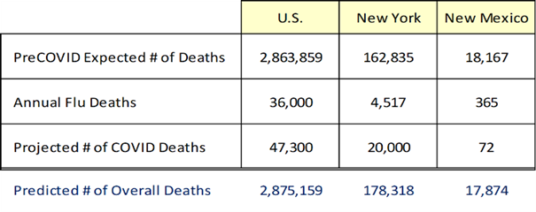
The results of applying our AM1 formula are shown in Table 10.1. The U.S. is on track to have 2,863,859 deaths in 2020 as actuaries predicted pre-COVID. Similarly, New York is tracking to have 178,318 deaths from all causes and New Mexico 17,874.
An equally valid alternative method for utilizing actuarial tables to make sense of corrupt CDC data is to first estimate the number of people who will die in 2020 for all causes including COVID. To accomplish this, we divide the total number of deaths to date from all causes by the number of days since January 1st, and then multiply that value by 365 days per year as shown in the Actuarial Method 2 (AM2) formula
AM2: Total Deaths = [Deaths to Date / Days to Date] * (Days in Year)
This method assumes that even though government officials and medical professionals are falsifying COVID death data, the actual number of people who die is being accurately reported, something we will question later but assume true for now. Again though, while we know how many people have died, we’ve lost the ability to know how they died.
Table 10.2. Estimated Number of 2020 Deaths from All Causes, Including COVID, by Actuarial Method 2 (AM2).
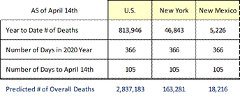
AM2 tells us how many people are likely to die this year from all causes, including COVID, assuming the death rate experienced thus far this year continues post-apex as it did pre-apex. Applying CDC reported data from the April 14th COVID apex, AM2 yields the results shown in 10.2.
Both approaches are valid even though they yield different results due to how we extrapolate current evidence to the end of the year – in science multiple pathways to a solution always exist. The first method is based on pre-COVID expectations, and the second on observable evidence. An argument for using AM1 is people don’t die at a linear rate as AM2 assumes. On the other hand, COVID must have an impact, as do lockdowns and quarantines, which make AM2 equally appropriate because the effects of mitigation measures are embedded in the data. Ultimately the argument is mute because by the end of the year the two approaches converge to nearly the same outcome.
Utilizing actuarial data provides a reasonable way to pierce through corrupt COVID data to get at what’s really going on. These two models can be combined with our statistical model based on Italian COVID data, and our exponential model based on the observational evidence. Our actuarial models utilize pre-COVID expectations layered with the impact of COVID. While each of our models render different results, they trend closely and provide informational pieces of the overall COVID puzzle.
If AM1 and AM2 assertions hold, the total number of deaths due to something in 2020, including COVID, will be between 0.9% below and 0.4% above pre-COVID expectations. This seems shockingly low given the marketed mass-hysteria, but we arrived at this prognosis using trusted data and logically consistent formulas. However, as scientists, we reserve the right to modify our logic based on new information, so our framework can change going forward.
No one should dispute that COVID’s real and it’s hard to argue against some mitigation measures. However, without a rational analysis of facts to put things in perspective, without an objective assessment of data, we can’t make informed decisions regarding appropriate crisis management strategies and things are only exacerbated when data’s corrupted.
While 0.87% of Americans die every year, the population grows 0.5%. In 2019, the population of the U.S. was 328.2 million, there were 3.788 million births and 2.863 million deaths for a decrease of 924,000 (0.28%). However, the U.S. population grew 1.64 million (0.50%), which means the delta was due to migration or immigration depending on your political denomination.
We began our COVID analysis trusting CDC data, but evidence indicates that trust is diminishing in part due to the source of CDC data, i.e., medical professionals. While CDC compiles and interprets data, they rely on medical professionals to provide raw data[5]. Whenever you go to the doctor, your information gets uploaded into CDC databases, and if your doctor intentionally or inadvertently mis-enters data, it diminishes the truthfulness of CDC reports. For reasons yet to be explored, medical professionals are being financially incentivized to misinform CDC. Historians will ultimately conclude that COVID’s reliance on intentionally corrupted data caused unfortunate crisis mismanagement.
In addition to medical malpractice, CDC is manipulating data as their reports either do not comport with observable evidence or wildly change without justification. Every country has a COVID narrative;[6] the U.S. overcounts COVID deaths, while India, Russia, and China undercount, which means postmortem scientists must devise novel techniques for performing trustworthy analyses with untrustworthy data, a challenge to be sure, but possible if we allow ourselves to be creative as we did with AM1 and AM2.
Multiple states confess to overcounting COVID deaths, some by as much as 57%, so we don’t have reliable data on how many people died from COVID. What we do have is trusted actuarial data on the number of people expected to die this year before COVID emerged and the number of people who have died, and the difference is a measure of COVID’s impact. A similar phenomenon existed during the Spanish Flu, which why a hundred years later estimates of deaths range between 50 and 100 million. This is the legacy impact of national narratives and falsifying death data.
Our AM1 and AM2 models have uncertainty since we cannot know the impacts of mitigation measures. However, given the untenable situation medical professionals put us in, this is the best we can do. We can apply a risk-based approach by looking at the odds you experience certain outcomes. For example, the national odds of dying from COVID are currently 1 in 10,000. In New Mexico it’s 2 in 100,000. Meanwhile, the odds of dying in a car accident are 1 in 114, during a walk 1 in 647, and in a commercial aircraft accident 1 in 9,821. If you’re concerned about dying from COVID, then forms of travel must terrorize you, because you’re eighty-seven times more likely to die in a car crash than from COVID, fifteen times more likely on a walk, and just as likely in an aircraft accident. If you want to carry our risk-based logic to the absurd (i.e., reductio ad absurdum)[7] the odds of dying from a legal execution in New Mexico are 1 in 119,012, or slightly less than dying from COVID, and New Mexico doesn’t allow capital punishment.
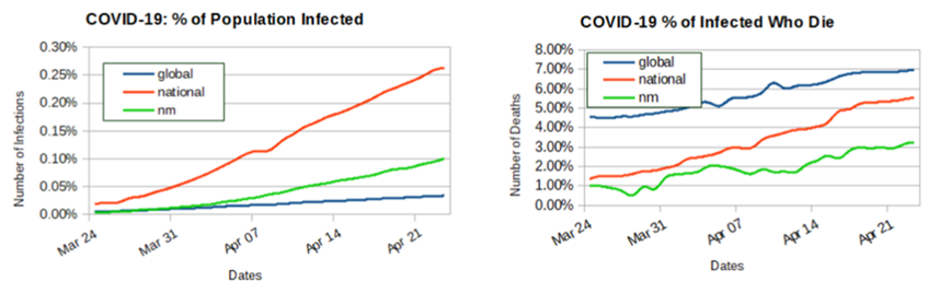
Figure 10.1. WHO and CDC COVID Data Through April 23, 2020.
To complete our actuarial analysis with corrupted data, let’s use WHO and CDC data from April 23rd. The world’s population is ~7.8 billion, while the U.S. population is 328 million, and the population of New Mexico is 2.2 million. The percentage of the world infected with COVID at that time is 0.034%, while 0.263% of Americans are infected, including 0.1% of New Mexicans.
Figure 10.1 shows both encouraging and concerning trends. On the plus side, the global rate of infection is essentially flat. Since March 24th, 2.2 million people have become infected, but the percentage of the population infected has only increased 0.028% and this could have more to do with testing than infection rates as previously discussed. Nationally the news is not as good, since March 24th, 842,564 Americans have been infected and the percent of the population infected has increased 0.244%. What’s concerning is that the U.S. rate of infection is growing ten times faster than the rest of the world but again, this can have more to do with our testing, which is why rates of infection are a poor metric and it’s difficult to understand why government and media don’t understand this.
The reported number of infections in New Mexico has grown 2,110, or 0.095%. The percentage of the population infected can only increase over time, which means the curves can never go down, we hope the slopes lessen, or flattens, over time. While the global curve is flattening, the slopes for both the U.S. and NM are increasing, which is not good news but does not necessarily run counter to our model’s assertion COVID “plateaued” on April 14th and the epidemic ended on June 7th.
Another caveat is that the percentage of the U.S. population infected is disputed. While the CDC puts the number at 842,624, the Stanford University study suggests the number could be 50-80 times higher. Given the lack of success academia has getting anything right, I don’t put much stock in that study, particularly since they did not adequately or randomly sample their population.
The death rate graphs in figure 10.1 are alarming. The global rate of those infected who die continues upward, which means the chance someone dies once infected is increasing. Since March 24th, 184,351 infected people have died, but more alarming is that the percent of infected people who died has jumped 2.42%. In March 4.54% of infected people died but by April 23rd, the rate grew to 6.96%. Nationally the news is just as bleak, March 24th to April 23rd, the percent of infected who died increased 4.20%. Just by virtue of testing more the rate should be dropping, but in March, 1.35% of people infected died but by late April the rate climbed to 5.55%. While some of this delta is tied to lag time between a reported infection and a subsequent death, and some of it’s due to data falsification, the U.S. rate of death is growing faster than the rest of the world, which is not good.
New Mexico deaths grew by 70 from March 24th to April 23rd. While this may not seem like much, the percentage of NM’s infected population who die increased 2.21%. New Mexico’s current rate of infected who die is 3.21%, which is below both national and global rates but steadily increasing and if current trends continue, New Mexico will soon lead the nation, which seems odd given our sparse population.
The percentage of those infected who ultimately die can fluctuate, which means these curves can come down over time. The goal is to slow the rate of death to the point the curves trend downward, which is an indication that mitigation measures are working and/or the virus is attenuating. Since the U.S. overcounts COVID deaths, the plots are incorrectly trending upward.
A normal flu season runs from October to as late as early May, so the data in figure 10.1 includes a flu cycle. If COVID is manmade, it should fully attenuate after the first wave, which means the COVID pandemic would be heading toward remission. It’s also plausible COVID was engineered to have a devastating second wave. That’s the thing about synthetized viruses; we have no basis for assessing behavior. Figure 10.1 indicates the world and nation are not where we want to be, however, that all depends on the extent to which the data can be trusted.
During the 2017 flu season, 45 million Americans were infected (14%) and of those infected, over 80 thousand died (0.18%)[8]. So far this flu season, the CDC estimates that between 24–62 thousand Americans have died from the flu. While the issue of how flu versus COVID deaths is counted, or double counted, is unresolved, the published number of COVID deaths are currently at 46,785, which makes the impact of COVID comparably less than the flu, which begs the question, why the hyperbolic hysteria?
An interesting take away is that flu deaths in 2020 could be as much as 33% higher than COVID deaths, when a flu vaccine exists so why have state and federal governments not forced us into complete isolation to prevent the spread of flu. What do they know about COVID they’re not sharing? And more important, why haven’t they reacted this aggressively in past years when flu death rates were higher? After all, this flu season is not all that out of bounds from other seasons. Other than political leverage, why is a COVID death more unacceptable than a flu death? It’s fascinating to consider from our COVID-mandated isolation.
Note: This chapter is based on a series of 2020 essays submitted major media, including the NY Times, Washington Post, and Chicago Tribune. The essays can be found at: https://rmdolin.com/commentary/
Read full “Truth and Trust in Crisis” book
[1] Worldometer (worldometers.info)
[2] IndexMundi – Country Facts
[3] CDC amends Florida’s COVID-19 numbers after inaccuracies (nypost.com)
[4] Don’t Believe Everything You Read About Flu Deaths | HuffPost
[5] California’s COVID-19 Data Is Inaccurate and Incomplete (governing.com)
[6] COVID-19, lies and statistics: Corruption and the pandemic (phys.org).
[7] Reductio ad Absurdum | Internet Encyclopedia of Philosophy (utm.edu)
[8] https://nationalinterest.org/blog/buzz/worse-covid-19-flu-killed-80000-americans-last-year-145592
