Chapter 8 in the R.M. Dolin book, “Truth and Trust in Crisis,” 2021
Two timelines determine when the COVID crisis ends, one based on a CDC formula for endemic viruses and the other based on when its politically permissible. We previously calculated the crisis ends on June 7th, but politicians, supported by their cohort of culpable doctors, complicit academics, and compliant media, say not until after November elections; let’s see what the data says.
We’ll assess four expert models making May/June projections and evaluate their performance relative to our assessment to determine if our June 7th prediction is reasonable. If our end-of-the-epidemic date is confirmed, we can declare the crisis over. Don’t be surprised though, when COVID’s main narratives demand an alternate reality.
May 17, 2020: The Coronavirus Task Force lead by Brix/Fauci declare COVID’s expansion stops on April 14th, which is represented by the blue curve in Figure 8.1. Since then, the CDC daily death data follows a steep but steady decline, (red curve). On May 15th, the death rate reverses course, it may just be a coincidence or a reporting anomaly, but it happens to coincide with Fauci’s Senate testimony where COVID’s politicalization is on full display.
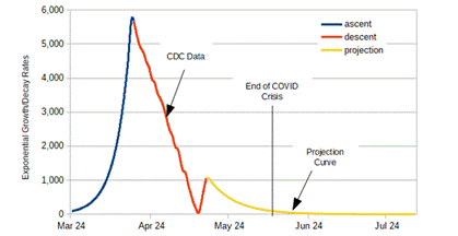
Figure 8.1. COVID Death Data with an End of Crisis Projection.
CDC has a history of sensationalizing data to align with political narratives. If you believe COVID data can’t be corrupted, in Minnesota, getting hit by a bus is considered COVID caused, in Florida, motorcycle crashes are no longer vehicle accidents, they’re COVID cases, at the VA, suicide is now a COVID calamity, and in Colorado alcohol poisoning is considered a form of COVID.[1] A Denver resident whose blood-alcohol content was found to be seven times over the legal limit (0.55%), is initially declared dead by alcohol poisoning but the ruling is changed to COVID-caused.[2] In April, Colorado health officials declare three nursing home fatalities as COVID deaths, even though attending physicians rule they’re unrelated to COVID. Sadly, these are not Colorado’s only cases of COVID corruption.[3] These kind of data shenanigans lead Brix to recently declare “There is nothing from the CDC that I can trust.”
New York and Pennsylvania admit to overcounting COVID deaths by over 50%. Other states accused of fudging COVID death data include California, Minnesota, and Washington. It may be coincidence, but a correlation exists between states that falsely inflate COVID death data and states having Democratic governors. With so many non-COVID related calamities now listed as COVID, the miracle of medical accounting is on track to eliminate all other forms of illness and death.
While Colorado revises their COVID death data downward 24%, other states are less forthcoming. This begs the question, if lock-down states intentionally overcount, are free states equally guilty of undercounting? Is each state creating unique fiction to suit marketing narratives? If so, what hope do scientists have of quantifying this crisis; unless the goal of our political purgatory is to obfuscate data to the point credible postmortems become impossible.
What politicians, academics, medical professionals, and the media fail to understand is truth has a way of permeating obfuscation. A technique often employed in science while trying to prove one thing is to look for evidence somewhere else. For example, let’s by-pass government-controlled CDC to wrap your mind around the fact that the U.S. has 4% of the world’s population but accounts for 29% of global COVID deaths. Raise your hand if you think this seems plausible given our general state of health, high standard of living, enviable healthcare system and aggressively proactive mitigation measures.
According to IndexMundi[4] prior to COVID, 165,000 New Yorkers were expected to die in 2020 from things like heart attack, cancer, flu, etc., which translates to 452 people per day. As of May 17th, 62,200 New Yorkers have died, while the expected pre-COVID number is 62,314. This means that even with the highly hyped crisis, New York has only 114 deaths above pre-COVID expectations. Watching the New York governor’s daily briefings suggest both he and his compliant media are not only misleading us, they’re needlessly causing widespread worry and hysteria.
Throughout this crisis, expert models have been consistently wrong by factors of ten, yet federal and state officials utilize them for policy making, which defies all reasonable and responsible logic. The media continues to legitimize these marginal models because it permits sensationalizing dystopian despair, which generates high-volume revenue. The star student in academia’s rush to soil themselves is UW, whose model is devoid of sound science. The fallacy of the UW model is that it’s developed by medical doctors pretending to be scientist, the same fine folks who believe getting hit by a bus is a form of influenza.
Sadly, UW is not the only campus club in the fray as Penn has an equally unscientific model projecting 310,282 COVID deaths by the end of June.[5] The ridiculousness of a COVID model coming from a business school stands on its own, but what pushes this to the absurd is both the government and media legitimize their projection because it aligns with prescribed narratives.
Penn estimates there will be 117,000 COVID caused deaths from May 1st to the end June if lockdowns continue, which translates to 2,187 people per day. Their model further asserts that if lockdowns end, 350,000 people die from COVID, which is 8,161 people per day. To put these numbers in perspective, at the apex of the COVID crisis, there were 4,900 COVID deaths in one day and the average throughout this crisis is 1,128 people per day dying from something the CDC claims is COVID caused, like motorcycle accidents.
The upper range of the Penn projection is twice what the COVID crisis experienced at its peak and seven times higher than the average daily death rate. If we believe Penn, May and June is going to be significantly worse than anything we’ve experienced so far, and given we’re mostly through a relatively mild May, their prediction is contrary to observable evidence, which leaves me questioning whether academic faculty ever lecture students on the need to validate models with either first principal calculations or observational evidence. Just because they successfully compile a software program and get an answer when executed, it is in no way indicative of the answer being correct or even reasonable.
We can compare the Penn/UW models by assuming conservatively the average projected Penn outcome results in 201,794 COVID deaths between now and the end of June, making their cumulative death count at the end of June 296,523. The UW model projects a cumulative death count at the end of June of 172,872. For the Penn model to be valid, 5,174 must die from COVID each day, and for the UW model to be valid, 2,004 Americans must die each day. Both projections are in stark contrast to CDC reported death rates that continues trending downward even with claims cancer is a form of COVID.
Our model predicts 98,000 cumulative COVID deaths by June 30th, and we continue to assert COVID ceases to be an epidemic on June 7th. Our prediction is significantly less than either academic model, but then again, we are not bound by the narratives of funded research.
May 24, 2020: CDC reports the lowest seven day running COVID death average since the April 14th apex. We’ve gone from a high of 2,579 deaths per day in April to a current low of 1,034 deaths per day. As Figure 8.2 indicates, our steady descent from the apex is slowing, which is expected as we approach the tail region of our exponential curve. We predicted in early May that the COVID epidemic would end on June 7th, and indications are we’re on track to hit our milestone.
Figure 8.2. Exponential Model Projection as of 24 May.
Pillars of academic excellence at Penn and UW paint a distinctly dystopian picture. Penn projects 4,007 COVID deaths per day in June, while UW projects 2,336 deaths per day. Our model predicts daily death rates decline until June 7th, when the rate drops below the CDC threshold for epidemics. This intuitively seems like an implausible prediction given government and media hype, but I urge you to trust the math and our model that has been spot-on thus far. It’s inexcusable that the nation’s STEM universities have abdicated responsibilities; allowing business schools and medical departments to define science. Fortunately, you and I are blue collar enough to figure things out on our own.
May 31, 2020: Its time assess the academic models to see how well they performed relative to our simple exponential model. At the beginning of May, CDC reported 63,023 COVID deaths and by the end of May, that count climbed to 103,153, for a May-month delta of 40,130, which equates to an average of 1,295 deaths per day. The seven-day rolling average at the start of the month was 1,852, while at the end of May it dropped to 1,015. We can conclude based on these numbers the crisis is abating.
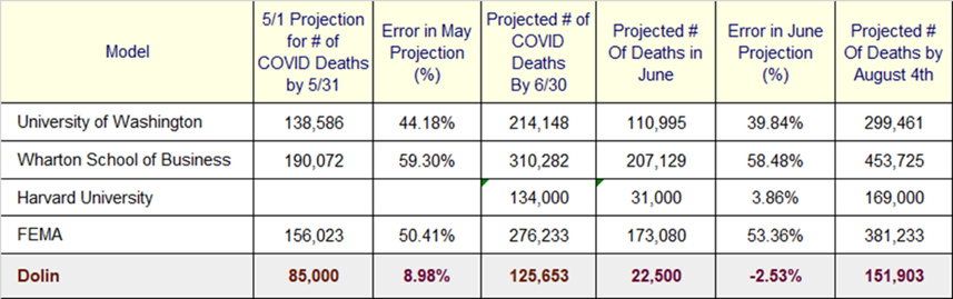
Table 8.1. Assessing COVID Model Performance for May.
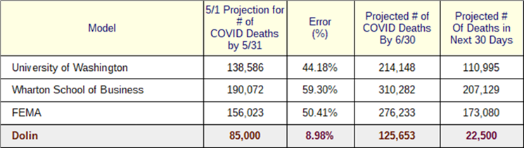
As Table 8.1 shows, the UW model predicted 138,586 COVID deaths by the end of May climbing to 214,148 by the end of June. The Penn model projected 190,072 COVID deaths by the end of May reaching 310,282 by the end of June. The FEMA model projected 156,023 COVID deaths by the end of May, reaching 276,233 by the end of June. All three models over-projected COVID deaths in May by ~50% and what’s even more disconcerting is they’re collectively predicting a significantly worse crisis in June, even though observational evidence indicates the crisis is abating.
Our model is once again spot-on with a May error rate of 8.98%. We project that 22,500 people will die from COVID in June, which makes our projection significantly lower than official models, which is astonishing given our model consists of a four-line program running on a $300 laptop.
June 7, 2020: At the beginning of May, our model estimated the COVID epidemic would end on June 7th, which given media hysteria and draconian government mandates seemed outrageous. Well, here we are at D-day, ready to see if we landed on the right beach. The UW model projects an average of 3,700 COVID deaths per day in June, the Penn model 6,904 deaths per day, and the federal model 5,770. One thing’s very clear, the “experts” don’t expect June to be pleasant or the epidemic to be over anytime soon. Our model projects 750 COVID deaths per day in June. As a benchmark, the CDC’s current rolling seven-day average is 1,015 COVID deaths per day. When you factor in that the CDC over counts by at least 25% and they report a combined PIC number, the adjusted COVID death rate could be as low as 761, making our model spot on.
Brix/Fauci and the media don’t seem to realize the CDC reports PIC deaths. In other words, all three causes of death are reported by the CDC as one number. The daily death count for phenomena and influenza during a normal flu season is around 750, which means that once the PIC number drops below 750 per day, we can conclude that the number of COVID caused deaths is having minimal impact and the crisis has abated.
Table 8.2. Actual Versus Expected Deaths Through June 7th.
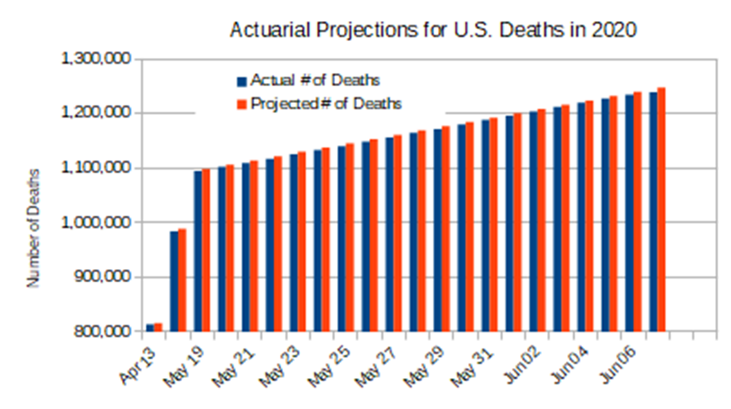
To independently confirm the COVID epidemic is over, we make the following observation: the only reasonable way to untangle the mess medical professionals have made falsifying COVID deaths is to look at actuarial data. The pre-COVID number of Americans expected to die from all causes by June 7th is 1,244,135 as shown in Table 8.2. The number of Americans who died from all causes including COVID by June 7th is 1,242,783, which means 1,352 fewer Americans have died thus far this year than were expected to die pre-COVID. The data suggests COVID caused fewer Americans to die so far this year than expected, which is astonishing; we’ll investigate why this is happening latter, and the reasons will be equally astonishing.
COVID has become as political as epidemiological, and the crisis cannot be declared over until politicians have an exit strategy shielding accusations of mismanagement. Currently forty-two states have reopened with no reported spike in COVID deaths. In New York City, 400,000 people return to work, indicating NY politicians know the crisis is over.[6] Coincidentally, both political parties are getting necessary cover to divert attention away from crisis mismanagement. Republicans have treason hearings to intoxicate their base with the possibility Obama was involved in a failed coup. Meanwhile, Democrats have riots to remind their base who’s got their backs come November.
Medical evidence comes from 1,000 healthcare professionals who signed a letter advocating violent riots should not be shut down because of COVID.[7] They argue that the needs of a small segment of society to riot trumps the rights of the larger population to remain safe. Since medical professions supposedly follow an oath to “do no harm”, they can only reach that assessment if the crisis is over.
Media struggles to make COVID matter is additional evidence the epidemic is over as they work relentlessly to maintain hysteria; sometimes on their own, and other times with the help of the medical, academic, and political professions. Media venues dutifully follow the profit models of their mentors, William Hearst and Joseph Pulitzer who advocated sensationalized journalism, even if forced to make stuff up.[8], The very nature of media’s exhausting attempts to scare us with increasingly absurd COVID boogeymen is qualitative evidence the crisis is over.
Pundits predicted 7 million jobs would be lost in May but instead, 2.5 million jobs were added to the economy.[9] It appears the peasant class has had enough of being scared and manipulated, as 80% of all small businesses are now reopened, some after being jailed in defiance of overzealous governors. The greatest fear government has is citizen disobedience, so as Americans again taste the refreshing newness of freedom, state and federal politicians are quickly acquiescing.
Markets have equally spoken. Despite lock-down governor’s attempts to stall recovery, American confidence is returning with the stock market soaring upward 1,000 points in one day, and up several thousand points over the past couple weeks; a consumer confidence metric the crisis is over.
While words and deeds of politicians, medical professionals, media, markets, and the masses are good, as scientists, we need quantitative evidence to support these qualitative observations. For that we look at how the CDC declares an epidemic over. An epidemic ends[10] when “the number of new reported illnesses [/deaths] drops back to the number normally expected.” CDC declares the end of an influenza outbreak when the number of infections or deaths, depending on the metric you are measuring, drops to a level at or below the number for endemic influenza. For example, the death rate for an average flu season in the U.S. is 36,000 per year,[11] which means when an influenza epidemic drops below that the outbreak is over.
July 14, 2020: CDC confirms that based on June COVID data, the epidemic is over.[12] While CDC does not point to a specific date, they indicated that “Based on death certificate data, the percentage of deaths attributed to pneumonia, influenza or COVID-19 (PIC) decreased from 9.0% during week 25 to 5.9% during week 26, representing the tenth week of a declining percentage of deaths due to PIC.”[13] The baseline death rate for COVID and other diseases such as influenza and pneumonia typically range from 5% to 7% at the height of flu season. According to CDC, the COVID epidemic is over when the death rate drops below 5.9%, which was achieved in early June, validating our June 7th prediction.
The CDC reference cited above declaring the COVID epidemic over in June, is pulled from the CDC website within days of being posted. Keep that bit of information in your back pocket as we continue our march toward the November election along COVID’s political timeline.
Further evidence that the COVID epidemic ended in June is confirmed by WHO. At the start of June, the global percentage of confirmed COVID cases resulting in death is 6.12%.[14] By the end of June that rate drops to 4.88%, which represents a significant increase in survivability (or decrease in mortality). The percentage of confirmed COVID cases resulting in death within the U.S. at the start of June is 5.87% and drops to 4.79% by the end of the month. The takeaways are
- The COVID survival rate significantly improved in June.
- The U.S. is currently performing better than the rest of the world in terms of COVID survivability, which is the opposite of what’s being told by Brix/Fauci and the media.
Government and media narratives assert the increase in COVID survivability is due to more people being tested, however, these same people ridiculed President Trump when he made the same assertion months earlier. Mathematically, survivability can be computed as “s=d/t”. Where d is the number of COVID deaths and t is the number of people tested. As more people are tested, t increases but the number of deaths is not affected by increased testing, so the ratio d/t goes down which translates to survivability increasing.
According to IndexMundi[15], through June, the country experienced 4,128 fewer deaths than pre-COVID expectations. Given that 1.44 million Americans have died so far this year, to be below the pre-COVID expectation is not only remarkable, it indicates the overall impact of COVID on U.S. deaths thus far is minimal. Just as significant, the delta between the Mundi’s pre-COVID projection and actual deaths has tracked the same all year. These two outcomes seem shocking given government and media hysteria.
Government and media continue to focus on infection rates to promote hysteria, but it’s a false flag unless the sample population is random; the population being tested is skewed because healthy people don’t generally test. The COVID death rate is the only metric that matters, and in June, not only did death rates remain constant, but hospitalizations also remained low at 98 patients per 100,000 infected.[16]
If the Stanford study is to be believed, at the end of June, 71% of the country has been infected, which means we are entering herd immunity. Rather than celebrate this milestone though, Dr. Fucci[17], lockdown governors, and the media[18] scare you into thinking a cataclysmic second wave is descending, however, the data does not support this assertion.
Table 8.3. June Month-End COVID Model Performance Results.
Since March, we’ve compared our COVID model against official expert models, and each month, our model has been spot-on, while theirs have been hyperbolically wrong. In mid-June Harvard joins the fraternity of non-STEM schools wading into the STEM swim lane; not with a predictive model, but with a model based on linear extrapolation. Recall from figure 8.2 that by June our exponential model enters the “tail” part of the decay, which means the rate of change is essentially flat or linear as was shown in figure 8.2.
Extrapolating linear death rates using linear extrapolation is akin to connect-the-dots graphing. This approach could not have been applied during the February to May timeframe because COVID was not behaving linearly, but once we enter the tail region of COVID’s exponential decay a linear model is applicable and, in that sense, can be used to independently validate our model.
Table 8.3 depicts how each of the expert models compares to June CDC data. Consistent with past performance, the government and academic models relied on for policy planning and to promote hysteria, are off by as much as 60%. Our model, which has accurately predicted COVID behavior since March, was off 3%. Given all the uncertainties involved in CDC data, 3% error is pretty much spot-on.
Harvard’s extrapolation was off by 4%, which is underwhelming when you’re using linear extrapolation to model linear behavior. Their simple analysis, however, validates our May assertion that there would be no COVID surge in June. The June performance of the other government and academic models is disconcerting because it reveals that in times of crisis Americans cannot count on “experts” to tell the truth, and we cannot rely on politicians to cast aside adolescent pettiness and make policy based on truth. In addition, Americans cannot trust the media to responsibly uncover and report the truth. Our simple exponential model demonstrates that finding truth within the crisis is not really all that hard if you apply Occam’s Razor (i.e., Law of Parsimony).
Raise your hand if you believed in April, when powerful government and academic models were promoting dystopian despair, our simple model’s end-of-COVID projection. I’ll admit I was a bit unsettled, but knew our model was good, our math consistent, and our evidence sound, so as scientists we pitched our flag where the math took us, devoid of political and profit motivated narratives. We’d be naive to believe that just because our model’s been validated multiple ways using vastly different approaches, that pre-COVID life is going to suddenly return. We’d be even more naive to believe that the political and profit motivative narratives can allow COVID to end just because our model and CDC says so. Instead, we are about to enter a new phase of our crisis, a phase so macabre science and sound logic may not save us: brothers and sisters, fellow travelers, welcome to the politics of crisis in a campaign season.
Note: This chapter is based on a series of 2020 essays submitted to major media outlets, including the NY Times, Washington Post, and Chicago Tribune. The essays can be found at: https://rmdolin.com/commentary/
Read the entire “Truth and Trust in Crisis,” book.
[1] Colorado man died of alcohol poisoning, but death was later blamed on coronavirus: report | Fox News
[2] Coroner’s office disputes Colorado coronavirus death claim, says victim died from alcohol poisoning | Washington Examiner
[3] Colorado Gov. Polis pushes back against CDC’s coronavirus death counts | Fox News.
[4] United States Deaths Clock – IndexMundi
[5] Coronavirus Latest: New University Of Penn Model Predicts 350,000 Deaths By End Of June If All States Fully Reopen – CBS Philly (cbslocal.com)
[6] New York City could see 400,000 workers return next month in first phase of a long recovery – POLITICO
[7] Over 1,000 health professionals sign a letter saying, Don’t shut down protests using coronavirus concerns as an excuse – CNN
[8] Yellow Journalism: The “Fake News” of the 19th Century – The Public Domain Review
[9] May jobs report: Unemployment rate comes in at 13.3%, better than expected (cnbc.com)
[10] Step 7: Decide an Outbreak is Over | Foodborne Outbreaks | Food Safety | CDC
[11] This Is How Many People Die From the Flu Each Year, According to the CDC | Health.com
[12] CDC: 10-Week Decline In COVID Deaths Means Possible Epidemic End (thefederalist.com)
[13] CDC: Covid Death Rate ‘Currently At The Epidemic Threshold’ | The Daily Wire
[14] coronavirus statistics – Search (bing.com)
[15] United States Deaths Clock – IndexMundi
[16] COVID Data Tracker Weekly Review | CDC
[17] Fauci: COVID-19 cases could swell to 100,000 a day if U.S. doesn’t control virus (nbcnews.com)
[18] Second wave of coronavirus hits US after state reopenings (nypost.com)
