Chapter 4 in the R.M. Dolin book, “Truth and Trust in Crisis.” 2021
On April 1st, the federal government asserts that in thirteen days the COVID crisis reaches its apex and begins to diminish. According to academic model projections, by the time the apex is reached, 250,000 Americans will have died from COVID. Their assessment of our collective fate is so dire, we set out to determine if a naturally occurring virus can contain such virulence and validated that it can. We review Italian COVID data and build a statistical inference indicating it’s more likely 30,500 Americans will die from COVID by Armageddon day. So, here we are, eleven days out, trying to sort out who’s more likely to be right. Given the disparity in predictions, one of us is going to be very wrong. If our model prevails, it opens a Pandora’s Box of questions, such as why experts think such a deadly virus only persists for 14 days before diminishing and on what basis do they assert COVID is the deadliest virus in human history when available evidence suggests it’s on par with normal flu outbreaks.
As our skepticism in expert assertions increases, so too does our sense flawed information is intentionally being generated as a false flag for hysteria. While confident CDC and Coronavirus Task Force statisticians diligently generate quality well vetted information, it appears crisis leaders don’t appreciate the caveats, because a rational person would demand validation before asserting the nation is about to experience a calamity of unprecedented proportion. If crisis leaders truly believe this assertion, why is there no massive mobilization and why are death industries not being prepared?
One aspect of Dolin’s Fundamental Law of Numerical Methods is that models depend on input to generate output, and input parameters can be tweaked to provide a wide range of results. Based on the disparity between official assertions and what existing evidence indicates, it seems Brix/Fauci don’t understand the complex mathematics underlying the models they rely on, or how sensitive those models are to slight variations in input. I’m less certain they understand a key fundamental tenant of mathematical modeling, namely “Garbage in equals garbage out,” and as we previously discussed, academics can’t be counted on to do due diligence.
Our simple exponential model demonstrates to get from 3,900 cumulative COVID deaths on April 1st, to 250,000 by April 14th, the function f(x)=ax, requires a=2.4052, and x=14. However, just as easily we can run this model with a different value for a, say one that’s 11% lower. If parameter a=2.165, the output projection for the number of COVID deaths by April 14th decreases to 61,351
This means an 11% decrease in parameter a, result in a 400% decrease in the output, which demonstrates how sensitive mathematical models can be to slight input variations. We can just as easily increase the input value of our base variable 11% to a=2.7, which increases output to 1,101,624; making an 11% increase in parameter a, resulting in a 440% increase in the projected number of COVID deaths.
This demonstrates why I began each semester of my Numerical Methods class telling students a mathematical model always provides an answer, and that answer is always wrong. It’s wrong because variables like a, cannot be known with certainty, and uncertain input leads to uncertain output. The true value of a cannot be known, only approximated. While we can use past data to infer future values, any such inference is fraught with uncertainty.
There are techniques for minimizing uncertainty such as scenario simulations using Monte Carlo to run a million random tests with different values for a to find a most likely value. But even then, whatever value is found, has uncertainty. This is a long-winded way of suggesting the nonscientist running the academic models may have guessed poorly when selecting values for their input parameters without regard to the impact on output. The remaining mystery is why they chose parameter values so unrealistic, is it based on unpublished COVID clairvoyance, do they know something about the virus they’re not sharing, or are they just that out of touch with observable evidence.
Given the estimate from our statistical inference that 30,500 Americans will die from COVID by April 14th, the corresponding value for a in our four-line exponential model is a=2.041. Where science differs from politics is we accept parameter a can never be known with certainty and continually strive to refine it. We utilize existing evidence to calculate values of a at different times and apply that knowledge to infer likely values for a going forward. The political constraints of the world where Brix/Fauci operate prevent them from adjusting their initial assertion to match reality for fear of looking incompetent, which ironically, is why they appear incompetent.
April 5th, Nine Days to Armageddon: Figure 4.1 shows that yesterday there was an 11% day-to-day increase in the number of infected American’s who died from COVID, which is far below the 243% increase required by government assertions and academic projections. Today’s data indicates that the day-to-day rate of change is 18%, which while higher than yesterday, is still below what’s required to reach 250,000 deaths by April 14th.
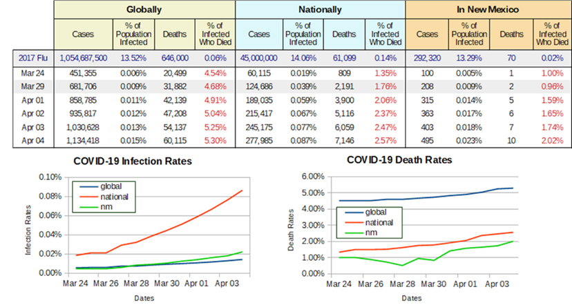
Figure 4.1. WHO and CDC Reported COVID Data Through April 4th, 2020.
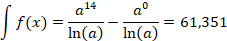
We can modify our exponential model to calculate a running value for a. For this we need a new value for variable x, based the number of days since the first COVID death, which occurred on February 29, or 36 days ago. Today’s cumulative death count is reportedly 7,146. What remains is determining a value for a that satisfies our modified exponential equation. Solving for a, we get that when a=1.224, the area under an exponential curve equals 7,153, matching CDC death data. Recall that to compute the area under the curve we integrate, making our modified mathematical model
April 7, One Week to Armageddon: We have now reached the midway point in our march toward Armageddon. While the current CDC death count is nowhere near government assertions and academic projections, an interesting development has emerged. Rather than revise their assertions downward based on current data as any rational scientist would do, the COVID experts are doubling down on their claims by deploying a cleaver sleight-of-hand. The White House, along with state governors who enacted draconian mitigation measures, are asserting that because of their emergency measures the COVID crisis is being brought under control.
This is an easy assertion to accept because it’s virtually impossible to dispute, however, with time comes the wisdom of clairvoyance and a Johns Hopkins study will conclude that COVID mitigation measures had little impact on stopping or slowing the virus spread.[1] This government sleight-of-hand tactic provides a “get out of jail free” dispensation for making fantastically inaccurate assertions while portraying themselves as heroes for saving the nation by wrestling the COVID beast into full capitulation; only because of Johns Hopkins, we know it’s a false flag.
For the past two weeks we’ve been using data published by the WHO and CDC to chart COVID’s behavior. Utilizing our simple exponential formula, we demonstrated that academic projections are increasingly losing alignment, not only with reality but with published data. When Bechtel, the world’s largest engineering firm, takes over management of Los Alamos, I enroll in their Six Sigma academy where they teach us to “speak truth to power.” The best way to do this is by trusting your analyses wherever they take you. As Americans are inundated with sensational claims about projected COVID deaths, our analysis leads to a significantly lower estimate that observable evidence and current data suggests is far more realistic.
Admittedly, our estimate relies on a simple mathematical construct, depends on reported CDC data, likely lacks the sophistication of academic models, and is not privy to the kind of insider clairvoyance Brix/Fauci have access to. We concede academic projections, and federal assertions, should be more accurate with higher fidelity than our four-line program, but data is as data does, and reality is an unyielding taskmaster. Bottomline is that in science, data demands an outcome that matches observational evidence; an outcome that cannot be massaged to meet a prescribed narrative.
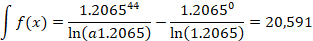
April 12th, Two Days to Armageddon: Today we consider CDC data from a fresh perspective to see if we can either validate federal assertions and academic projections or further confirm our model. To those who’ll review this analysis with future derision, our goal is to keep the discussion at a high school algebra level so forgive me for not providing Calc-III detail. Thus far, the entirety of our mathematical model is based on the simple exponential function

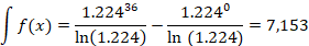
Utilizing CDC data, we find the value for parameter a best representing the data to date. Today x=44, since it has been 44 days since the first reported COVID death, and the cumulative death total is 20,608. For these values, a=1.2065, or
Notice as we approach Armageddon, the value for a is decreasing, which means the slope of the exponential curve is decreasing. This is an indication we’re approaching the curve’s apex. That parameter a is steadily declining is a remarkable outcome given all the hysteria being promulgated by the media. COVID appears to be trending opposite of Brix/Fauci’s assertion and academic projections. Meanwhile, CDC data seems to be validating our simple statistical model.
Further validation of the downward trend in a, comes from UW who today revised their model projection downward to 80,000. Why they readjust to a lower but still unlikely projection remains a mystery but it’s becoming increasingly obvious that grounding themselves does not involve a review of observable evidence. Meanwhile, the dire Brix/Fauci assertions have yet to be revised, even though official backtracking suggests they know it should be. The challenge for Brix/Fauci is bringing themselves to admit the fallacy of their sensationalized assertions without losing credibility. Their rhetoric continues to extol the success of mitigation measures, even though the Johns Hopkins study confirms they have little effect.
You and I have the only evidentiarily consistent COVID model, yet we must remain vigilant to potential up-ticks. If the world is being besieged by a manmade virus, we have no historical basis for understanding its behavior. Our model relies on past behavior for future inference and its likely federal assertions and academic models rely more heavily on undisclosed clairvoyance. Philosopher Aldous Huxley observed, “facts do not cease to exist because they are ignored,” and as any Wall Street broker or sports bookie can attest, losing fortunes based on undisclosed clairvoyance is rather routine.
It’s difficult to understand is why, in the face of mounting evidence, government officials and the media continue hyping that the COVID death count is about to catapult to levels never experienced in previous pandemics. What’s missing in their hyperbole, is any actual evidence that a dystopian Armageddon is about to darken the nation, but that does not tap down the parade of talking heads who emphatically know how dark things are about to get. While these experts are scaring an already panicked public with claims 250,000 Americans will die from COVID by April 14th, our model concludes a more likely estimate is 30,500. While our projection is unsatisfyingly high, for the government to error by a factor of eight is unconscionable; especially given their access to data.
To rescue credibility, Brix/Fauci need compliant CDC data and to that end, have incentivized complicit medical professionals to label virtually any death as COVID caused. An example from Minnesota is that if someone is hit by a bus, the cause of death is ruled COVID. When I taught Measurements Lab, we used the expression “dry-labbing” for the reprehensible act of falsifying data to facilitate a desired outcome. Incentivizing doctors to skew COVID data is tantamount to professional malfeasance, or to use more familiar terminology, malpractice. Compounding this travesty is the CDC has a history sensationalizing data.
Entertainers and social media influencers have yet to realize the extent to which they’re being manipulated, and it matters because in the digital age their prominence exceeds their capacity to grasp the detrimental impact they can cause, and it doesn’t take much to put an already panicked public in full tilt. In times of crisis people rely on news outlets for information. If you’re over sixty you probably remember the trust Walter Cronkite’s voice provided every evening as he reported with stoic seriousness on U.S. troop casualties in Viet Nam. Unfortunately, the trustworthiness of journalism has diminished to the point that news relies less on facts and more on the opinions of people disguised as experts. In a time when our nation desperately needs truth tellers, clear information vetting, and concise unbiased reporting, we are disappointingly denied. Michigan State Professor Jeff Richards[2] opined best by stating, “There is a huge difference between journalism and advertising. Journalism aspires to truth. Advertising is regulated for truth. I’ll put the accuracy of the average ad in this country up against the average news story any time.”
The inconvenient truth hiding in plain sight since this crisis began is that it’s not hard to ferret through WHO and CDC data to make realistic predictions using simple math. However, we appear to be in the early stages of what’s becoming a deliberate effort by medical professionals to intentionally corrupt CDC data. Armed with our simple statistical model and exponential tool, we’ve demonstrated that government assertions and academic projections are ensconced in hyperbole that the media’s chosen to sensationalize rather than investigate.
Like a horrific trainwreck we’re compelled to watch, we are witnessing government, academia, medical professionals, and the media work in concert against public interest even as their motivations remain elusive. What makes this fascinating is that we must assume the collaborative skewing of truth to match a narrative is not new given how quickly and seamlessly they coalesced. What historians will ultimately conclude that makes COVID a Waterloo moment, is that in the digital age science can be used to separate opinion-based hyperbole from data driven truth.
Brix/Fauci maintain their assertions only seem outrageous because mitigation measures are working even though that’s been disproven. If claims that efforts to “flatten the curve,” are the reason federal assertions and academic projections are off by a factor of eight, why don’t their sophisticated models capture the effects of their mitigation measures; after all, our simple model is managing to match the march toward Armageddon. Given all the intellectual horsepower behind their forecasts, why are we able to accurately model COVID outcomes while their high-tech software running on the world’s most powerful computers can’t? Shakespeare[3] might conclude, “something’s rotten in the state of COVID.”
Suggesting the impact of mitigations can’t be modeled is a false flag, government and academia have been modeling influenza outbreaks for years and know how mitigations work. Equally poignant is that the WHO/CDC data their models rely on have the effects of mitigation embedded in them, which is why our model captures the impacts. Watching Brix/Fauci attempt to reconcile the difference between their wild assertions and reality is like listening to politicians explain how they made millions on a $150k salary.
While COVID is a serious threat, when a ship’s taking on water, it’s the responsibility of leaders to correctly triage and properly react. There’s a huge difference between a leak that needs to be managed and a gaping hole in the side of the stern. In times of crisis, we don’t need leaders shouting in panic to abandon ship when the damage is manageable. Government, academia, media, and medical leaders have decided to go all in on hyperbole when they have a fiduciary obligation to accurately assess data and make realistic prognoses, something our four-line program is eminently capable of doing yet eludes these trusted experts.
April 13th, The Eve of Armageddon: Today, CDC director, Dr. Robert Redfield, announces the virus has stabilized, while cautioning that it’s still expanding, and the apex has not yet been reached. Let’s consider his statement to better understand what he means. If the virus is expanding, then the rate of growth for infections and deaths should be increasing. In terms of our simple exponential formula, it means parameter a increases over time. The apex occurs when the rate of change for the virus stops increasing. In absolute terms the apex occurs at the highest point in the rate of expansion after which, contraction begins. The apex can be over a period where the infection/death rate is nearly constant or has small fluctuations. Cynics will be tempted to point out that Dr. Redfield’s declaration seems properly on script as government experts predicted the apex would occur tomorrow.
If COVID follows a “bell-shaped” curve, then the rate of contraction should closely mirror the rate of expansion. In other words, if the number of people in the U.S. who die from COVID ten days before the apex is, say 20,000, then the number of people who die ten days after the apex should be ~20,000. Many things in nature follow bell-shaped curves, and thus far COVID’s behaving as a natural virus.
Reaching the apex does not mean the crisis is over, it means it’s no longer getting worse. Also, because it took 46 days to reach the apex does not mean it takes 46 days for the crisis to end, however, we’d expect it to happen in a somewhat similar timeframe. It’s also possible, if we’re not vigilant, expansion could restart; something I keep reminding my kids who are increasingly finding ingenious ways to bring normalcy back into their lives.
Tomorrow’s anticipated apex is an important milestone because it signals the worst is behind us and there is an offramp to government’s draconian mitigation measures. Dr. Redfield’s assertions align with our exponential model, which has not only stabilized, but begun to contract. Some will say both our statistical model used to predict the apex death count and our exponential formula used to model COVID’s behavior are too simplistic, while the more sophisticated federal and academic models consider more information with higher fidelity. Yes, their models are substantially more complicated but in science, that does not imply better outcomes. There’s an important axiom called Occam’s Razor[4], which states “Given a set of explanations for an event, the simplest one is most likely correct.”
Our simple statistical inference and exponential formula is what mathematicians refer to as a “first principles,” formulation, which means they rely on basic equations with minimal assumptions. Our formulations rely on CDC data while federal and academic models rely on that same data plus a plethora of assumptions and extraneous information not at our disposal. Ironically, CDC data has all the information needed about COVID’s behavior embedded in it. In that sense, our formulation has all the relevant information needed to make a credible assessment; it seems federal and academic experts don’t understand this.
CDC Director Redfield’s assertions are wrong. As we marched toward Armageddon, the values for parameter a, which we revise daily, show a steady decline since March 24th. In other words, the virus’s rate of expansion has been slowing for some time. I anticipate that tomorrow, federal and academic experts will tout their modeling prowess by proclaiming the apex has been reached, and that the virus rate of death is no longer expanding.
April 14th, Armageddon Day: On April 1st, federal and academic experts assert the cumulative number of COVID deaths on April 14th will be 250,000, and the virus will have reached its maximum rate of expansion. Having arrived at their dystopian climax, we can look back with postmortem clairvoyance to assess how well their assertions and projections match ground truth. But before that, we need to discuss the graphs in Figure 4.2, which represent infection and death rates.
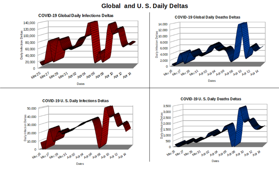
Figure 4.2. WHO and CDC Data as of April 14th, 2020.
WHO/CDC have an enormous task of compiling daily data and if data arrives late or during the weekend, it gets rolled into the next day’s totals leading to day-to-day variability. What’s important are the general trends. Also, I’m presenting the data in raw form. We could have used regression to smooth out noise, but raw data is not only less complicated, but it also has less uncertainty.
The plots on the left represent the global and U.S. daily infection deltas; notice they generally mirror each other. While the global chart seems to be bimodal (having two peaks), it’s probably more of a plateau with reporting inconsistencies. The important take away from these charts is that the COVID infection rates seemed to have reached their apex around April 10th; that both the global and national apexes occurred on the same date is likely a coincidence. From April 10th forward, the infection rates generally decline.
Federal assertions and academic models foretold the apex would be on April 14th, so it appears they missed it by 4 days, which isn’t bad given the magnitude and direness of their predictions. It’s prudent to be reticent about claiming too early that the apex has been reached because what appears to be an apex could later prove to be a momentary dip. Our model confirms what the CDC director reported, namely that there is ample evidence to declare the COVID apex has been reached, and we can all breathe a sigh of relief that COVID’s begun to abate.
The charts on the right, represent the global and U.S. daily death deltas; notice they generally mirror each other, which is significant because it validates the foundational assumption of our statistical inference model; namely that COVID behaves the same everywhere. This validates using Italy as a sample population to infer how COVID will impact America.
The U.S. and global death deltas peak on April 10th, which is odd since logically we expect there to be a lag between infection and death peaks. Logically, the infection apex should occur before the death apex, and they don’t, which renders the WHO/CDC data suspect. The steep decline in global death deltas post apex before a sharp rise probably has more to do with reporting lag. In general, both the U.S. and global death deltas seem to be in decline and while trends can always shift, this is good news for a worried world.
Federal assertions and academic projections said by April 14th, the U.S. will realize 250,000 deaths, when in fact 23,650 deaths have occurred thus far. This means they were off by a factor of 10, which renders their ability to make predictions akin to blindly throwing darts at a wall. Our statistical inference projected the nation would realize 30,500 COVID deaths by April 14th, so we were off by a factor of 1.29, which isn’t bad for a bunch of lock-down detainees using a four-line spreadsheet and some high school math.
The unresolved questions going forward are
- Do governments acknowledge COVID’s in decline and reopen economies while easing mitigations?
- Do academics admit to their inability to model or continue recklessly generating useless models?
- Will proper postmortems be conducted by trusted experts to get at the truth behind the crisis?
- Can we trust CDC data and if not, is there a way to determine the extent their data’s corrupted?
- Do STEM professionals who abdicate obligations leave their bunkers to conduct necessary peer reviews?
While some of these issues are beyond the scope of our investigation, the issue of trust in CDC data takes on increased prominence going forward, causing us to utilize unconventional avenues to find alternative sources of truth as we continue to use real science to debunk COVID mythology.
Note: This chapter is based on a series of 2020 essays submitted to major media outlets, including the NY Times, Washington Post, and Chicago Tribune. The essays can be found at: https://rmdolin.com/commentary/
Read the entire “Truth and Trust in Crisis” book at https://rmdolin.com/truth-and-trust-in-crisis/
[1] https://www.newsweek.com/did-johns-hopkins-study-prove-lockdowns-dont-work-what-we-know-so-far-1676724
[2] https://theysaidso.com/quote/jef-i-richards-there-is-a-huge-difference-between-journalism-and-advertising-jou,
[3] https://nosweatshakespeare.com/quotes/famous/something-rotten-state-denmark/
[4] https://conceptually.org/concepts/occams-razor
[5] https://www.eazystock.com/blog/calculating-forecast-accuracy-forecast-error/
