
To see other COVID posts, visit my Quarantine blog.
The fine folks from the University of Washington, who have famously and embarrassingly been wrong about every COVID projection thus far in this CRISIS have revised their re-revised model to now project that between 95,000 and 243,000 U.S. deaths will occur by August 4th, which contains such a large uncertainty that even they apparently have lost faith in their ability to predict. Meanwhile, the President predicts between 75,000 to 100,000 deaths by August 4th, with a narrower uncertainty band, he has a somewhat more confident and optimistic projection.
These estimates, along with mine, are based on CDC data. The concern is that the CDC has a history of sensationalizing data. For example, in 2014, the CDC predicted 500,000 people would die of Ebola in West Africa when only 28,600 died. This means that we have to treat published CDC data as suspect. For example, New York and Pennsylvanian both admit to overcounting their number of COVID deaths by 100%. Another reason the CDC COVID data is suspect is because the CDC has stopped reporting flu deaths this year. According to the CDC, there are no flu deaths this years as all flu-like deaths are being labeled COVID.
The ramifications of using sketchy CDC data are two-fold; first, all projections made using CDC data will be inherently high since the CDC numbers are inflated, potentially by as much as a factor of two. Second, its difficult to say how accurate any projection is, because there is no baseline number to benchmark against. This means that all projections you read about, including mine, are caveated with the disclaimer, “based on CDC methods of counting.”
The method I propose using to determine the true impact of the COVID virus, is to compare the overall number of deaths in the U.S. this year from all causes against actuarial projections for the number of expected deaths. Since actuarial estimates are used as a basis for insurance rates, you can bet they are historically accurate. Thus far in 2020, the overall number of deaths in the U.S. are 4,000 below what would be expected in a normal year, yes you read that right, 4k below expected. This means from an actuarial standpoint, the impact of COVID is not nearly as dramatic or horrific as the government and media would have you believe, but we’ll save that discussion for another day.
Projecting the number of deaths that will accrue by August 4th, based on the questionable CDC method for counting, depends on three variables,
- When the apex was reached (if it has been reached)
- The rate in which the death rate declines
- When the tapering tail of the projection curve can be truncated, which could be inferred as the point at which herd immunity occurs.
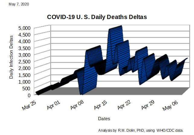
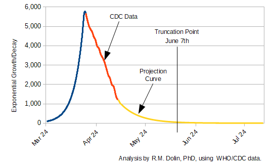
In the figure below, the blue line represents the exponential growth in COVID death rates up to the April 16th apex, benchmarked against CDC data. The red line represents the CDC data for COVID death rates from the apex to present. The yellow line represents an exponential projection of the COVID death rate from the April 16th apex out to August 4th, which is the University of Washington estimate for when herd immunity is achieved. Based on CDC data, the apex in COVID deaths was reached on April 16th (top of blue curve). The rate of decline can be benchmarked against CDC data from April 16th to present (red curve).
The area under the curves, represents the number of deaths, which is the integral of the exponent defining the curves. In general, if the function defining the behavior is represented by f(x) = a^x, then the equation defining the integral with respect to x, is
Integral of [f(x) = a^x ] = (a^x)/ln(a) + constant
From this equation, the area under the blue curve is 30,990, which correlates to the CDC reported number of COVID deaths on April 16th. The combined area under the blue and red curves is 73,431, which correlates to the CDC reported number of COVID deaths today.
The yellow curve approximates the exponential rate of decline in COVID deaths from today to August 4th. According to this curve, by June 7th, the rate of COVID deaths is 85 per day, with a total to that point of 85,656. This curve projects that herd immunity is reached months before the August 4th date projected by federal and academic models.
When herd immunity is reached, depends on where the curve is truncated. The exponential curve (yellow curve), extends to infinity so it has to be truncated at some point, and since the CDC counts all flu as COVID, zero will never be reached. The question then, is it reasonable to truncate at 50 deaths/day, or 5 deaths per day. FYI, I chose 85 deaths/per day because that’s how many Americans die each day from flu.
If we agree to truncate at 50 deaths/day, the truncation date is June 9th. If we choose to truncate at 5 deaths/day, that occurs on July 7th. Flu equivalency (85 deaths/day) occurs on June 7th.
Summary: The University of Washington projects that 243,000 deaths will have occurred by August 4th (their truncation point). President Trump projects 100,000 deaths by this date. Our model, based on CDC data and a first principles analysis projects that by a truncation date of June 7th, there will have been 85,656 COVID deaths. Further, our analysis projects that after June 7th, the COVID death rate is aligned with normal flu rates, which means that all respiratory deaths after that date could be attributed to the flu.
Another important conclusion based on the data to date is that the rate of decline is nearly as steep as the rate increase. In other words, the rate at which the country went from zero deaths on February 28, to the April 16th apex is nearly the same as the rate in which the virus is declining. If we experience the same ascent and descent rates, the truncation date would be on June 2nd, which means my June 7th projection is pretty close. It also means that states should be fully re-opened no later than June 5th. . . don’t count on that though, as they have the CDC inflating and sensationalizing numbers for them.
