
To see other COVID posts, visit my Quarantine blog.
If you recall from posts back in early April, we used the simple exponential function, f(x) = a^x, to perform a first principles analysis that accurately predicted the COVID death count on the federal government’s mythical apex day of April 14th. At that time we discussed how expressions such as this were commonly used to model population growth and decay in things such as gypsy moth infestations and radioactive decay.
We can again turn to this approach to derive an estimate of the number of COVID deaths at the point when herd immunity is reached (60% of population infected), but its a bit more complicated than the models we developed yesterday. First, we have to use the plots above to estimate when we think the apex in death rates occurred. From there we can use CDC data to develop the exponential curve that models the ascent up to the apex.
In order to develop an exponential curve that estimates the descent down to herd immunity, we have to determine a date when herd immunity will be achieved. Once that is done we can generate the curve and after that we can integrate the two halves to find the area under the curve, which will be the cumulative number of deaths at herd immunity.
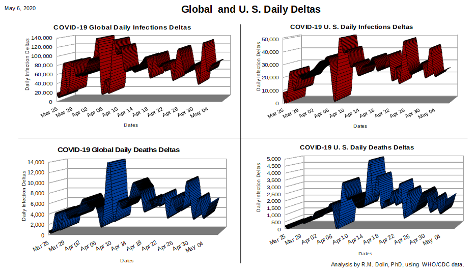
We begin with an assessment of the two plots above representing the U.S. infection and death deltas. The apex for COVID infections in the U.S. appears to have occurred on April 9th. Since there is always a lag between infection and death, its reasonable that the apex for the COVID deaths in the U.S. would appear sometime later. In fact, the lower right plot above indicates that this apex occurred around April 16th.
Rather then argue with federal projections of when herd immunity will be reached (topic for another day), we will assume it is on August 4th, per their model projections, which is 101 days from the April 16th apex.
Model 1: Simple Linear Approximation
Following the edict of Occam Razors, we begin with the most primitive method for projecting the number of U.S. deaths likely to be realized by August 4, which is linear projection. To baseline, we can use linear projection to model the ascent up to the Apex, and then the descent from there to today. After that, it’s a straight line projection of herd immunity on August 4th.
The approach is to use the calculus of numerical integration to find the area under of the curve highlighted in red, which represents a linear approximation to existing CDC data along with a straight line projection from today out to August 4th.
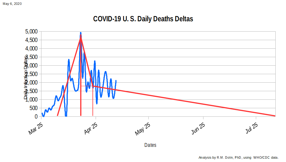
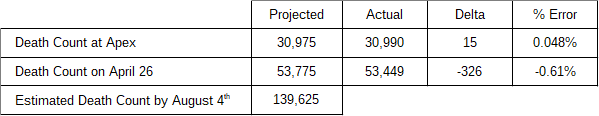
As you can see, the CDC data (shown in blue) can be approximated on the ascent as a straight line. The area under the ascent curve, which represents the number of COVID deaths through April 16th, can be represented as a triangle with a base of 14 days and a height of 4,425 deaths per day. The area of this triangle (0.5 * base * height), is 30,975, which is within 0.05% of the actual number of U.S. COVID deaths by this date, as shown in the table below.
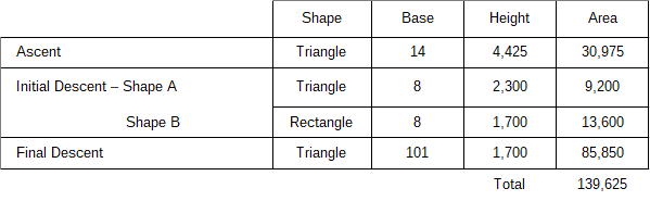
The initial descent from the apex is represented as two linear shapes, a triangle and rectangle. The base of each shape is 9 days (April 15th to April 25th). The height of the rectangle is 1,700 deaths per day while the height of the triangle is 2,300 deaths per day. If you are wondering how I got these numbers, I just read them off the above plot. Using this linear approximation results in an error of 0.6% relative to actual data, which is pretty close for a linear analysis.
So far we have benchmarked our linear model against actual data with good correlation. Now we are ready for our leap of faith. If herd immunity is assumed to be reached on August 4th, then it is 101 days from today and our approximated current rate of COVID deaths is 1,700 per day, based on our curve fitting approximation. The area under this triangle is 85,550.
This makes the total projected number of U.S. death due to COVID by August 4th, 139,626. For reference, the highly touted University of Washington model puts the number between 95,000 and 243,000, which is such a wide range as to be rendered meaningless. A range this wide is an indication that UW does not trust their model and they lack sufficient abilities to discern it’s results. The President’s projection is between 75,000 and 100,000, which makes my linear projection way outside his estimate.
Linear model approximations to nonlinear data are best a rough first order fit, we can do better.
Model 2: Exponential Approximation
A more accurate method of predicting the number of U.S. deaths due to COVID by August 4th, would be to treat the COVID response exponentially rather than linearly. This allows for a slower start on the ascent to the apex with a faster summit, and vice versa for the descent. This was the approach we used in late March to accurately predict the U.S. death count by April 14th, which the federal and academic models got wrong by a factor of ten.
We follow the same approach taken for the linear model, namely, to build a model through today benchmarked against actual CDC data and then exponentially project out to August 4th.
As our drama builds, you’ll have to wait for the exciting climax. . . I need to go for a run without my facemask before the COVID cops start their patrols.

I truly appreciate this article post.Really thank you! Really Great.
Thanks so much for the article.Much thanks again. Cool.
A round of applause for your blog article. Great.
Looking forward to reading more. Great blog.Much thanks again. Want more.
Thanks-a-mundo for the blog post.Really looking forward to read more.
Very informative blog. Keep writing.
Looking forward to reading more. Great blog.Much thanks again. Will read on…
Very informative article post.Really looking forward to read more. Really Cool.
A big thank you for your blog.Thanks Again. Really Great.
Really enjoyed this post.Really thank you! Great.
Wow, great blog. Fantastic.
A round of applause for your blog article.Much thanks again. Cool.
I really like and appreciate your post.Really looking forward to read more. Really Cool.
Wow, great post.Thanks Again. Want more.